Color is more than just a visual element; it’s a powerful tool for evoking emotions and setting the tone for any gathering. When hosting an event, choosing the right colors for your tablescape and decor can enhance the atmosphere and make guests feel a certain way.
Understanding Color Psychology
Each color carries emotional significance. For example:
- Red: Excitement and energy, perfect for lively gatherings.
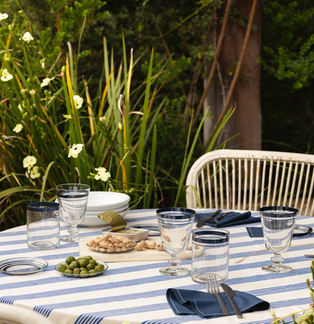
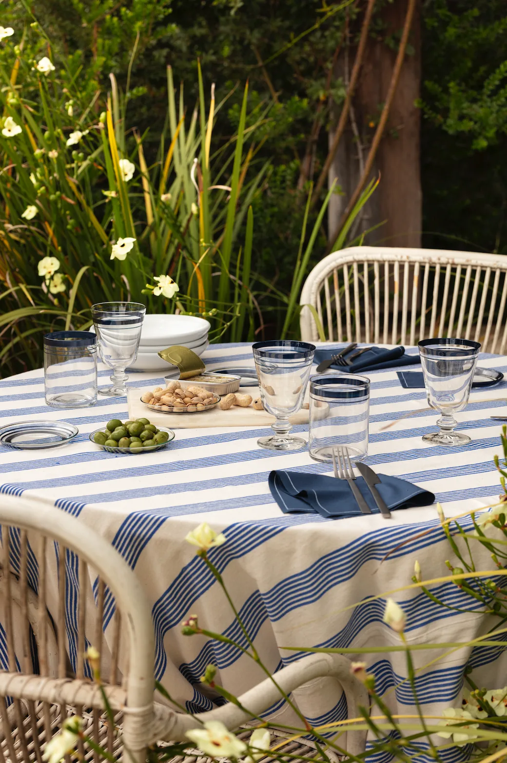
- Blue: Calm and trust, ideal for intimate or professional events.
- Yellow: Happiness and warmth, bringing a cheerful touch to any table.
- Green: Freshness and balance, great for nature-inspired or relaxing settings.
- Purple: Luxury and creativity, fitting for sophisticated, themed parties.
Using Color to Set the Mood
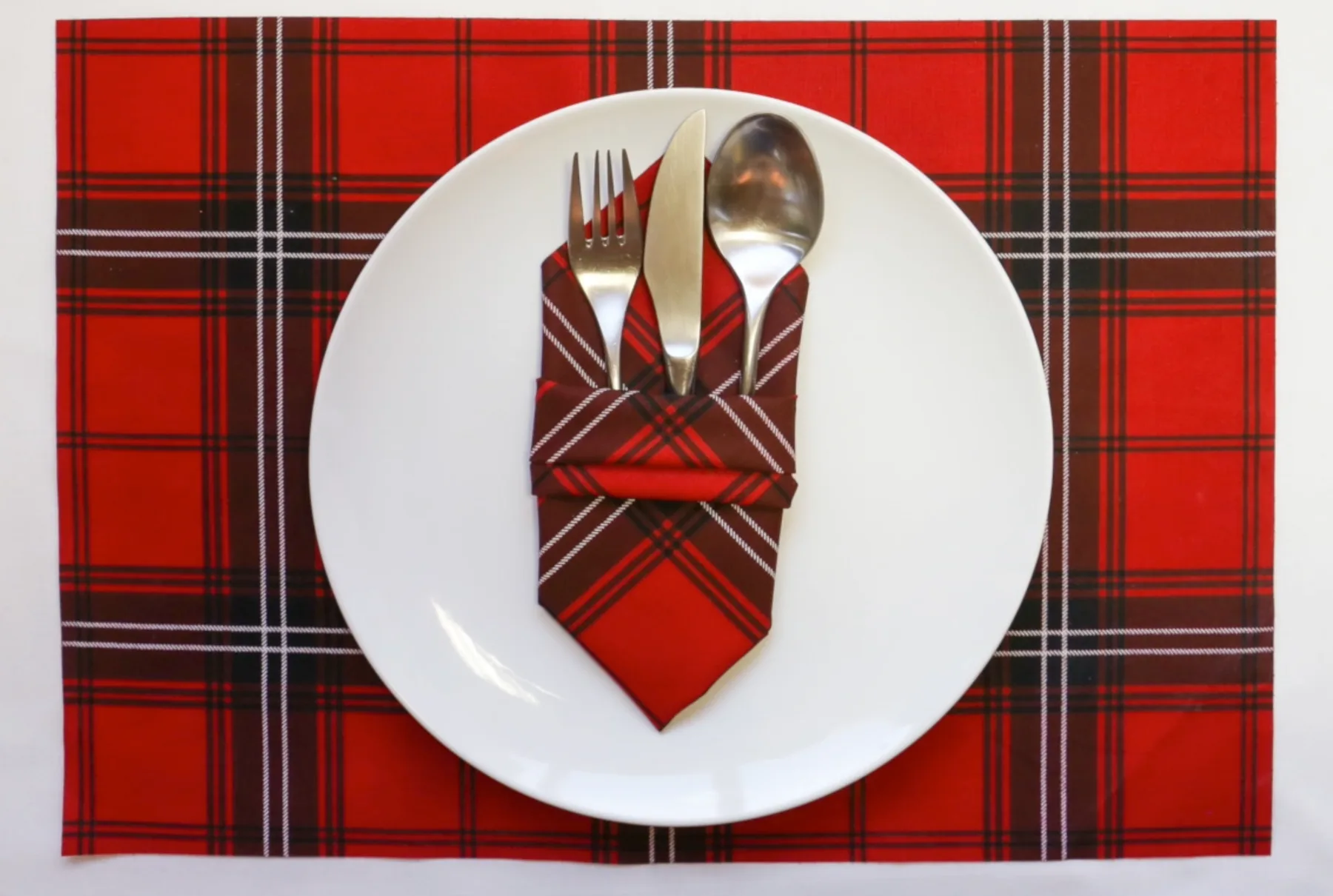
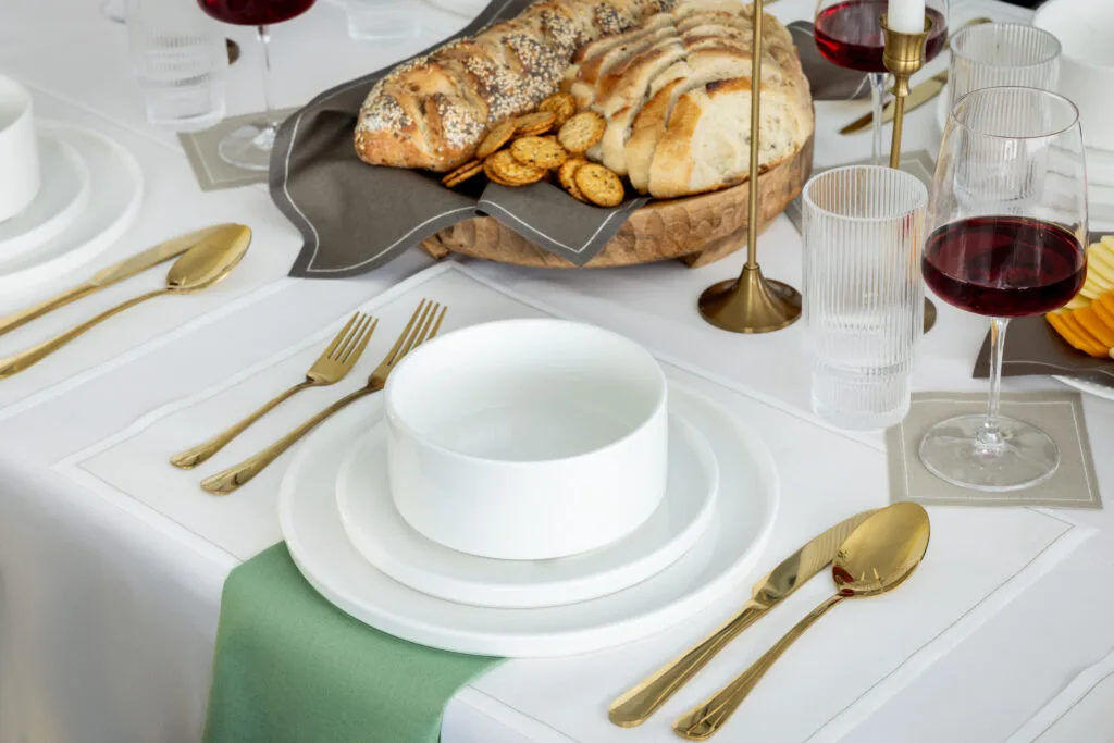
Consider the mood you want to create when selecting your color palette. For instance, A dinner party might call for warm hues like deep reds and oranges, creating an inviting, cozy vibe. A spring garden party could include pastel shades like lavender, peach, and mint green, bringing a fresh, airy feel. In contrast, a holiday gathering may use bold reds and greens to evoke festivity and joy. Meanwhile, a cocktail hour might feature metallics like gold or silver, adding a glamorous and sophisticated touch to the decor.
Layering Colors for Impact
When layering colors in your decor, think about how contrasting hues can create visual interest while maintaining harmony:
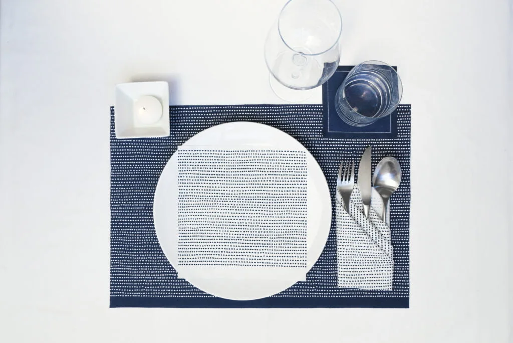
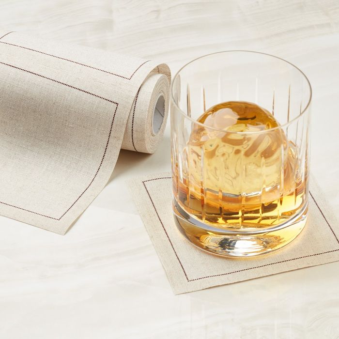
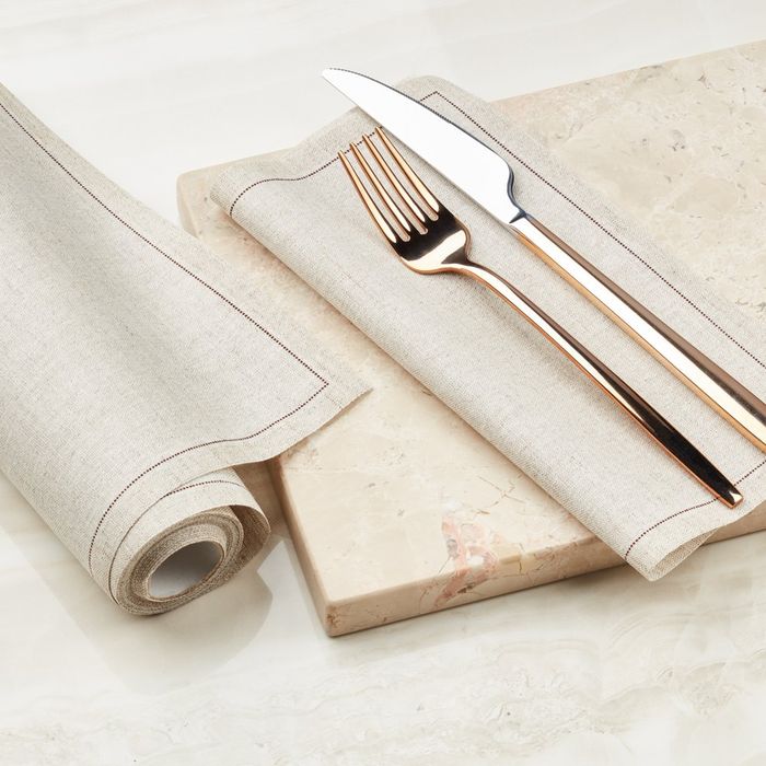
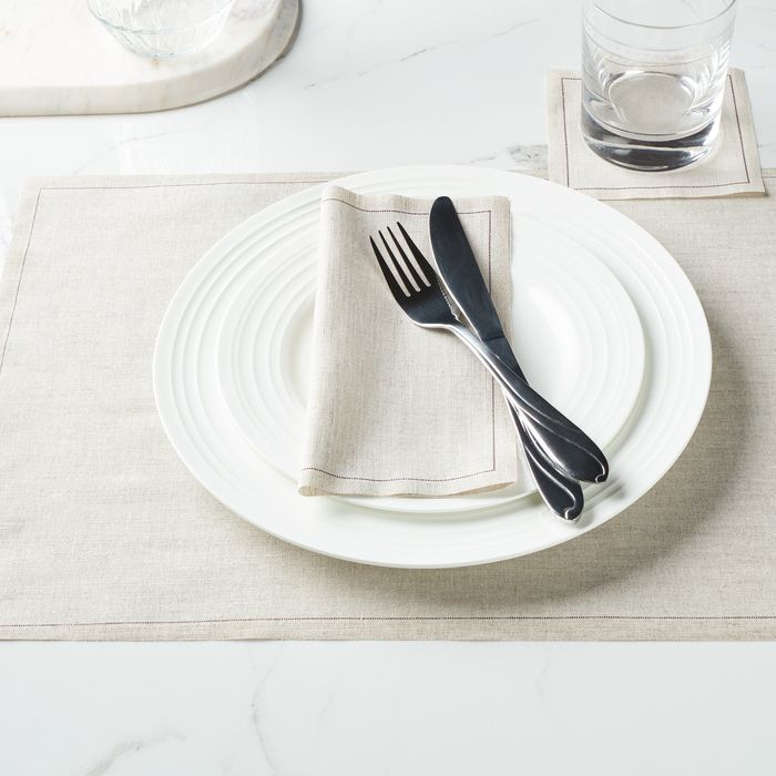
- Neutral + Bold: A neutral palette (white, beige, grey) serves as a perfect foundation, allowing you to layer bold accents like navy blue, gold, or burgundy. This combination adds depth without overpowering the senses. For instance, a white tablecloth with gold napkins creates a luxurious yet understated feel.
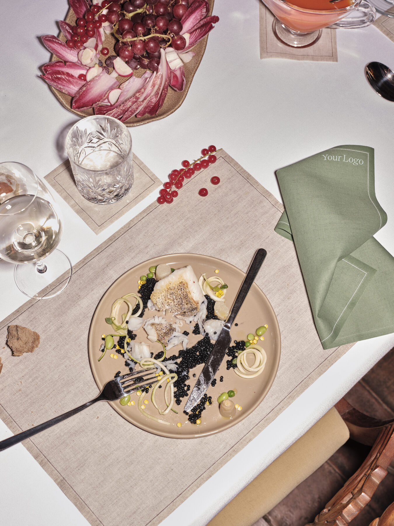
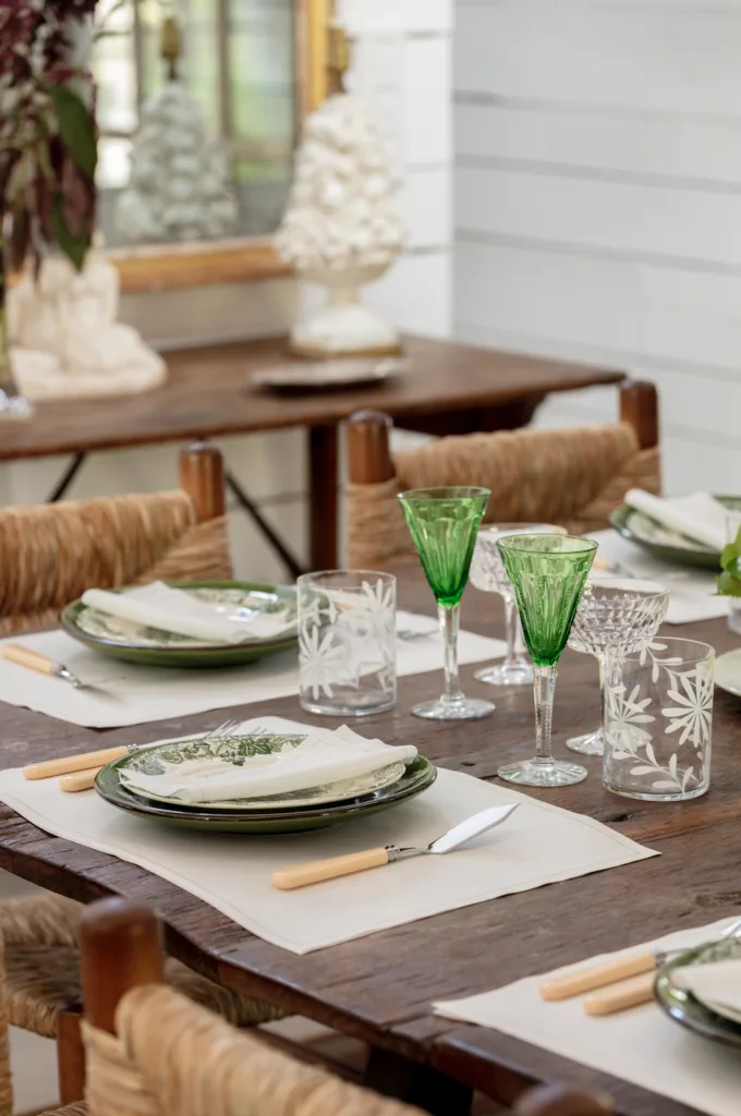
- Monochromatic Tones: Using different shades of one color can create a seamless, sophisticated look. A tablescape in varying shades of green, from soft sage to deep emerald, evokes a sense of unity and tranquility while still maintaining visual interest.
- Analogous Color Scheme: This involves using colors next to each other on the color wheel, such as blue, teal, and green. These combinations feel cohesive and calming, perfect for relaxed, intimate dinners or brunches.
- Complementary Colors: Pair colors that are opposite on the color wheel (like purple and yellow or red and green) to create a striking, dynamic effect. This works well when you want to draw attention to specific parts of your table, such as using vibrant flowers or statement plates against a neutral backdrop.
By thoughtfully combining colors, you can create a tablescape that not only looks beautiful but also enhances the emotional experience of your guests.
Sustainability Meets Style
MY DRAP’s range of eco-friendly napkins and placemats offers versatile color choices that align with your sustainable hosting goals. Choose colors that complement your event’s tone while maintaining the elegance of a green lifestyle.
Remember, the right color scheme can elevate your decor, create an inviting atmosphere, and help your guests feel just the way you want them to.