Shop over USD 75 and enable FREE Standard Shipping in US
Color is more than just a visual element; it’s a powerful tool for evoking emotions and setting the tone for any gathering. When hosting an event, choosing the right colors for your tablescape and decor can enhance the atmosphere and make guests feel a certain way.
Each color carries emotional significance. For example:
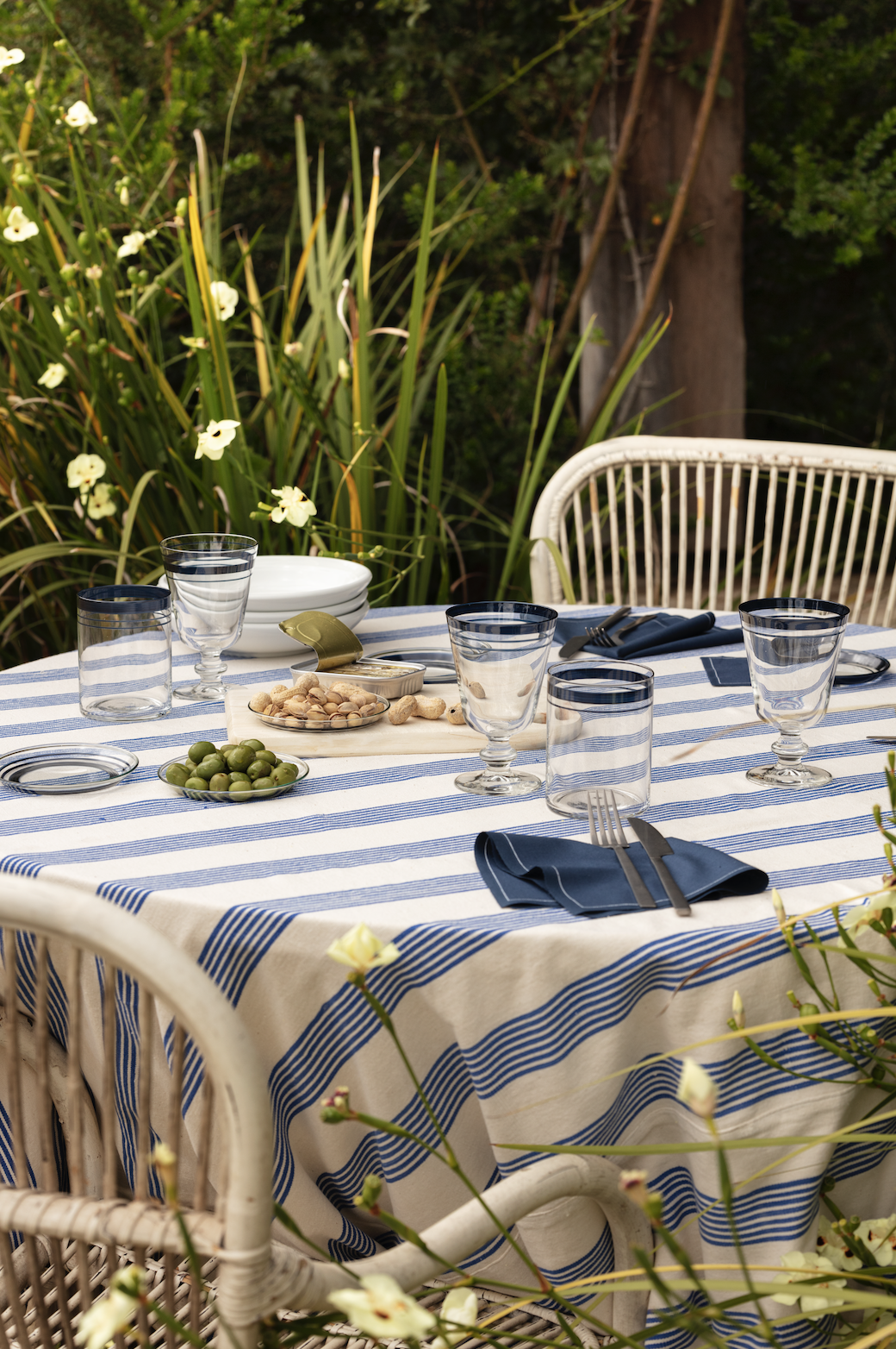
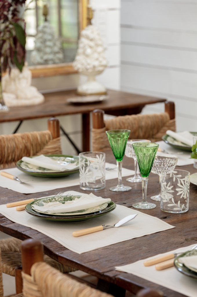
Consider the mood you want to create when selecting your color palette. For instance, A dinner party might call for warm hues like deep reds and oranges, creating an inviting, cozy vibe. A spring garden party could include pastel shades like lavender, peach, and mint green, bringing a fresh, airy feel. In contrast, a holiday gathering may use bold reds and greens to evoke festivity and joy. Meanwhile, a cocktail hour might feature metallics like gold or silver, adding a glamorous and sophisticated touch to the decor.
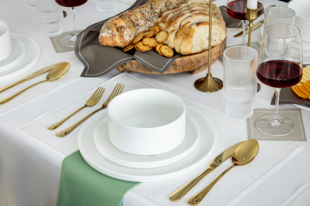
When layering colors in your decor, think about how contrasting hues can create visual interest while maintaining harmony:
By thoughtfully combining colors, you can create a tablescape that not only looks beautiful but also enhances the emotional experience of your guests.
MY DRAP’s range of eco-friendly napkins and placemats offers versatile color choices that align with your sustainable hosting goals. Choose colors that complement your event’s tone while maintaining the elegance of a green lifestyle.
Remember, the right color scheme can elevate your decor, create an inviting atmosphere, and help your guests feel just the way you want them to.


